The Challenge
To better understand the pain points Doctors deal with on a daily basis helping people lead healthier lives. They had issues with on-boarding patients, missed appointments, and working with the Electronic Medical Records. Our goal was to create a painless way to manage both their patients, and practice.
My Role
Initially I was the sole designer on the project. I owned the project end-to-end, doing user research, IA, UX, UI, Visual Design and marketing collateral. I worked with Product & Engineering to understand challenges and create the best app possible.
Personas
Understanding health needs of HEALIOS users
I’m not a Doctor and I don’t play one on TV, so it was important to connect with real doctors to understand what was causing so much burn out in their profession. I also met with patients to understand their needs. This helps me “live in my user’s shoes,” build empathy and identify a course of Design action.
Dr. Janet – 56 Pediatrician Bayview Pediatrics
Uses iPhone/Laptop Connects with Doctors on Doximity
She feels the EMR is overly time-consuming, inflexible, and plagued with errors. If she spends 15 minutes with a patient, she spends 45-60 minutes documenting their EMR. EMRs aren’t connected so it is hard to get a patient’s full story.
Dr. Omar – 50 Endocrinologist EastBay Endocrinology
Uses iPhone/Laptop Connects with Doctors on Doximity
Has issues on-boarding patients to his clinic, transcribing paperwork to digital is time consuming and error prone. He has issues with last minute appointment cancellation even though he charges a $50 fee.
Kara – 35
Patient
Product Manager
Uses iPhone/Laptop Connects on Facebook/LinkedIn
Kara travels for work and has chronic health issues. She has ended up in emergency rooms and urgent care outside her home state. She would like to “carry” her EMR with her at all times, and message her doctor if she has a problem.
Martin – 85
Patient
Retired
Uses iPhone
Not really an online person
Martin is on multiple medications. He has issues with his memory. He has accidentally taken his medicine twice in one day, and also forgotten it completely. He needs a digital checklist, alerts and alarms to track his meds.
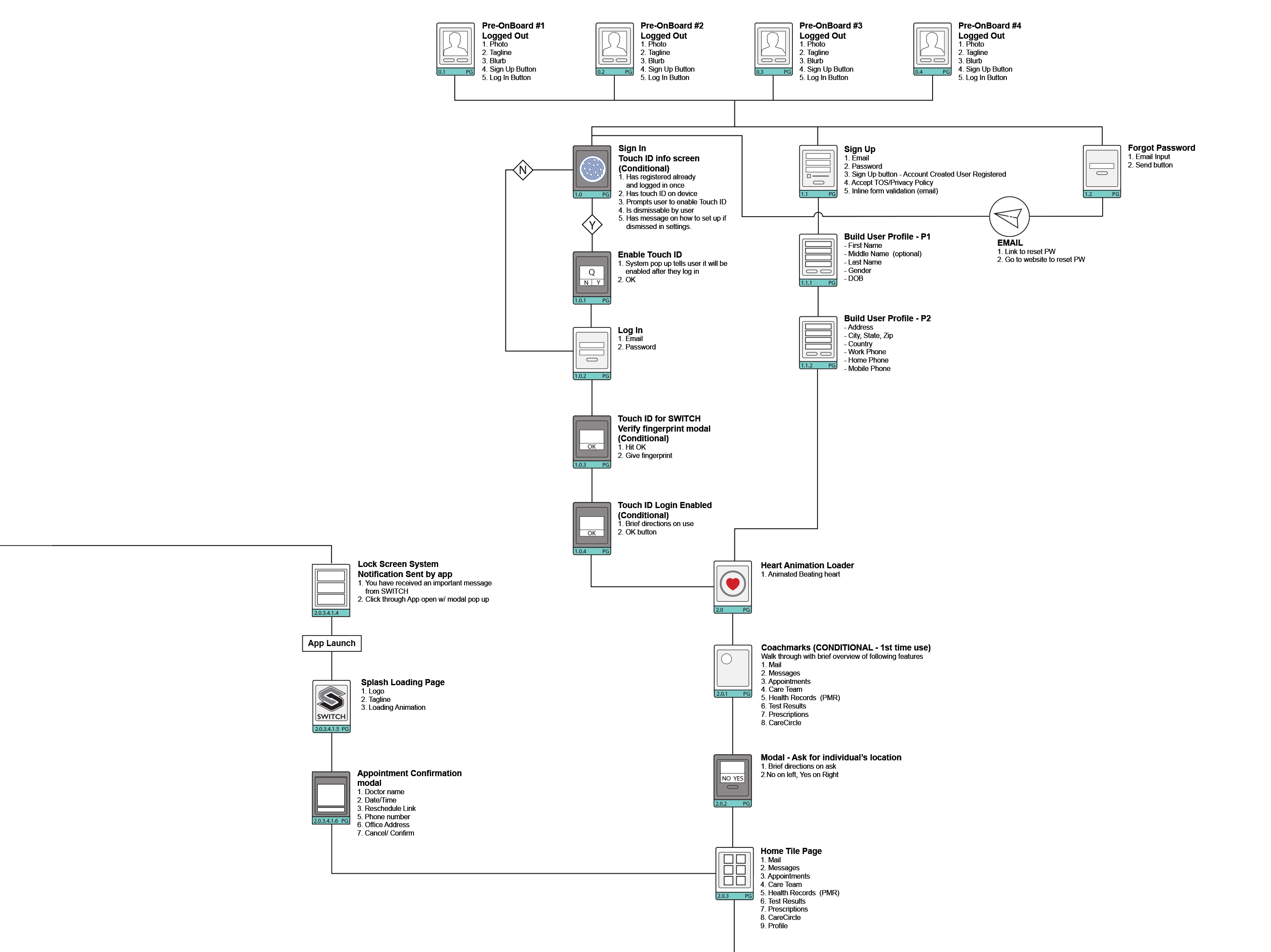
Sitemap – (Partial Flow)
Due to time constraints and costs it was decided we would use an external offshore engineering team instead of hiring on site. Worried there would be communication glitches, I drew detailed sitemaps, numbered the pages, and matched them to the Box asset folders. Then I printed the sitemaps on an oversize printer and shipped them to the team to hang in their studio.
View zoomable vector PDF (opens in new tab)
Site Flow – CareCircle
One of the key features of the app was created after a conversation with a patient who was diagnosed with breast cancer. She told me the 1st phone bill after her diagnosis cost her $700+ because she had to grief council her relatives on her diagnosis! This spawned the CareCircle a personal medical social network to keep your friends and family informed and designate a guardian in the event you can’t make decisions for yourself.

The Healios Prototype (formerly SWITCH*)
After getting sign off on all the wireframes, flows, and mockups, I put them into Marvel which allowed me to add gestures and animated transitions between pages so it feels like a real app. Then I ran usability tests with the two target audiences to see if they grokked the new designs.
(*SWITCH was the internal working title while we explored brand names.)
Lo-fi clickable prototype user test results
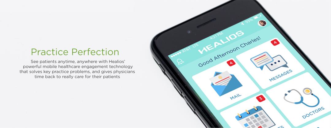
Home screen dashboard
• Do people understand all the features on the home screen?
• Do they like the look & feel?
• Do they understand how to navigate?
• Could they track their health?
• Would they use the CareCircle with friends and family?
Participants:
• 6 women
• 4 men
- Understood all the features on the home screen 100%
- Like the look & feel? Flat 2.0 design 90%
- Understood how to navigate through the app 100%
- Able to easily track their health? 95%
- Used the CareCircle to invite friends and family? 80%
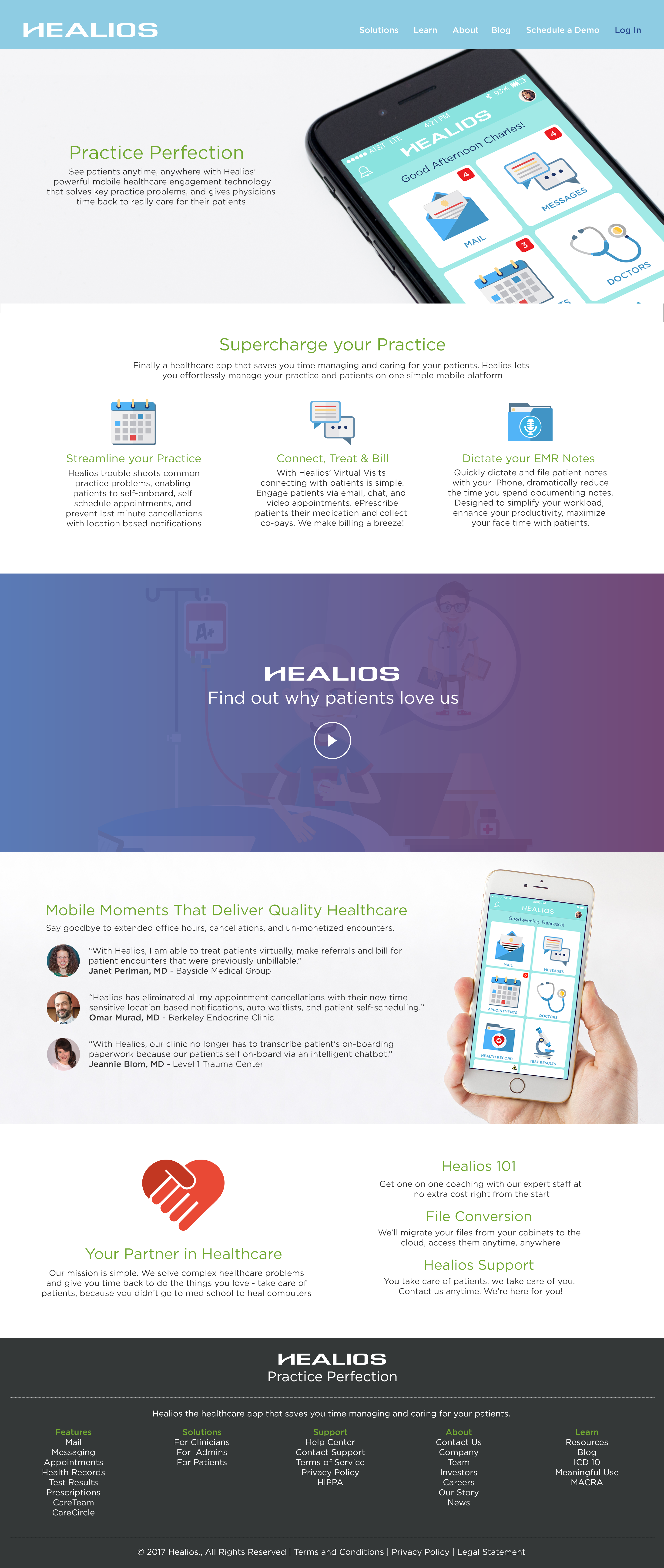
Establishing the Look & Feel
Medicine can be intimidating and diagnosis downright scary. My goal was to keep the app clean, simple and vibrant. I went with a playful Flat 2.0 design instead of pure flat design which has serious usability problems with older demographics. The biggest usability issues introduced by flat design is the lack of signifiers on clickable elements.
The Results
Healios has launched in a limited beta release (MVP) with a series of small practices and their patients to get feedback and grow the application features before pushing to a wider US release in late 2018. So far, it has been very well received. Doctor on average are saving two hours a day on notes. Admins no longer have to transcribe on-boarding paperwork, and patients can easily synch their calendars with the practice and quickly find the next available appointment. Cancellations have dropped 75% due to a robust notification
system and the ability to reschedule via the patient app.