The Challenge
Over-the-Top (OTT) messaging apps like WeChat line and WhatsApp, are poised to overtake SMS. Stats show that users are sending fewer SMS messages. WhatsApp, the leader in OTT messaging, has nearly 700 million monthly actives, but isn’t kid-safe. This sparked a question…Could Disney enter the OTT space and imagineer a kid-safe, family friendly chat app?
My Role
I directed the UX and Art on Spark. I took a kid friendly user-centered design approach. I crafted personas to help inform the design, and devise a successful product pitch for green light review with Bob Iger. I worked with the Head of Product and the Engineering Manager to understand the challenges and imagineer the best chat app ever..
Strategy & Vision
I created sketches, wireframes, user flows, and animated prototypes for user testing. I also used them to share the vision, design principles, and the content strategy. This helped evangelize design ideas, gain alignment, and drive decision-making forward.
Planning & Scope
I partnered with senior product managers to define Spark. I evangelized for great UX, guest’s needs, and for balance between Design and Business goals to craft a delightful experience. I negotiated for app features and prioritized them for MVP.
Team Management
I collaborated with Globant, an outsource agency located in Buenos Aires, Argentina. I oversaw the work of their UX designers, artists and their developers (visual QA of the work). I gave reports on the work to key Disney stakeholders.
Leadership
I presented design ideas to gain buy‐in from PMs, directors, and SVP stakeholders. I evangelized the benefits of Spark as a powerful viral marketing platform to Marvel, Star Wars and Disney Animation to get persmission to use their content in Spark.
Personas
Create deeper relationships with Spark users
Q: Why create personas?
A: Because you are not your user
I create personas, which are archetypes, to help me live in my user’s shoes, build empathy and identify my guest’s real needs. Personas help me understand “guestpectations” in order to design the best user experience possible.
Creating personas helps me to research and spend time thinking about which types of users are critical to the business so I don’t waste precious time (and money) thinking about edge case users who don’t contribute.
Steve (Dad) – 46
Wealth Manager
User Type
Benefactor
Funds and gifts virtual currency
Uses iPhone/iPad
Connects with friends on LinkedIn, Skype and Facebook
Takes kids to Disney twice a year when they visit his mother
He’s likes Marvel and Star Wars games, movies, and comics
Monika (Mom) – 39
Interior Designer
User Type
Benefactor
Funds and gifts virtual currency
Uses iPhone/iPad
Connects with friends on Skype and Facebook
She has an FB page for her business. She’s been a Disney fan since she was a child and loves going to the parks. Her favorite Disney movie is Snow White
Erika (Daughter) – 12
Student
User Type
Whale
Spends virtual currencies on sticker packs
Uses iPhone/iPad
Connects with friends on Facebook, Vine, Instagram, Kik, iMessage, Facetime.
She is a huge Disney Princess fan. Her favorites are Violet of the Incredibles, Ariel, and Princess Merida.
Vincent (Son) – 9
Student
User Type
Whale
Spends virtual currencies on sticker packs
Uses iPhone/iPad
Connects with friends on Club Penguin
lays Angry Birds, Saints Row, Clash of Clans, Happy Wheels, Avengers Alliance, Minecraft, Bad Piggies, chats on xbox
Loves Marvel, StarWars and Pixar
My Design Process
Be flexible and delight your guests
Imaginative
I aspire to imagineer design innovations that surprise and delight. Working for Disney gave me license to dream, and mastermind magical creations. I leverage Disney’s rich history for inspiration when designing, and stand out by looking forward to the future.
Local/Global
I design products that are scalable and localizable. I realize we need to speak to everyone and reach a global audience, but I try to recognize the individual user as well, keeping things as personal as possible. My design work is inherently open and accessible to all Disney guests.
Iterative
Iterative I use an iterative design methodology based on a cyclical process of wireframing, prototyping, testing, analyzing and refining. Why? Because changes are easiest and least expensive to implement in the earliest phases of design, before you start developing.
Usable
My mission is to handcraft delightful products that are simple and easy to use, Guests should be able to easily intuit how our apps work by just looking at them. To quote my favorite usability guru and author – Steven Krug, “Don’t make me think.”
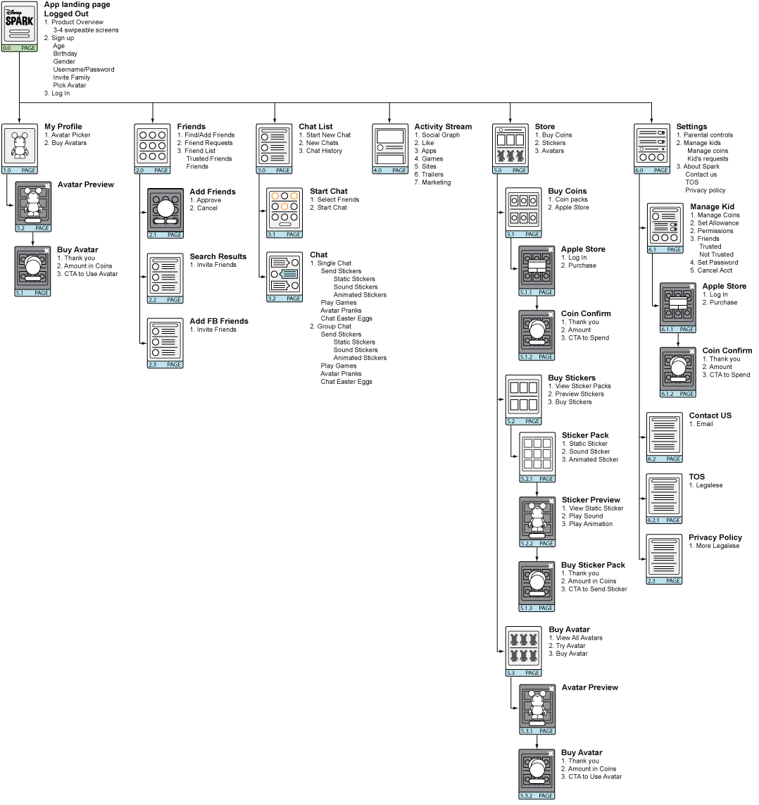
Sitemap/Mini Flow
I use sitemaps to figure out how many pages are needed for MVP and to clarify what the product’s goals are before I start creating wireframes.
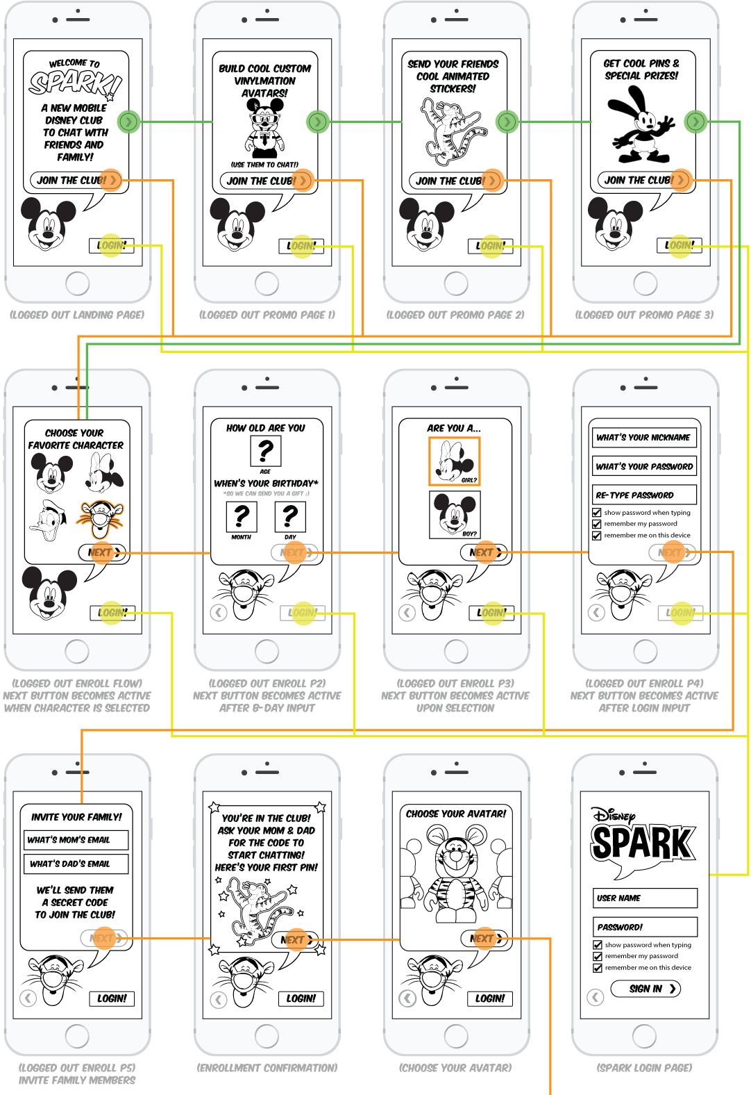
Wireframing/Flow
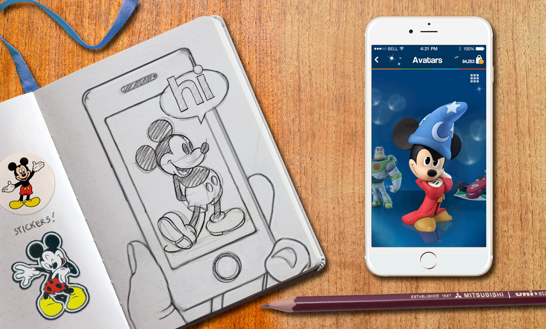
Wireframes, whether created on paper, whiteboards, or software apps, serve to prioritize content and determine how much space to allocate to an item and where it is located. This is the first pass example of on-boarding. These were specifically designed for kids 7-12, I used Marvel to prototype and test on mobile devices.
Lo-fi clickable prototype user test results
5 boys, 5 girls, ages ranged between 8-10
All Kids tested accessed favorite apps via iPads primarily, and had access to iPhones via parents. All kids were familiar with apps, played games. Kids were familiar with texting/chatting, didn’t yet have a dedicated texting/chatting apps themselves.
- Understood gesture interactions in the app 90%
- Kids knew how to report someone when bothered 95%
- All kids tested understood what a USERNAME is 100%
- All kids knew they needed COINS to purchase sticker packs and avatars 100%
- All understood the concept of TRUSTED FRIEND vs FRIEND 95%
- Kids understood that the VINYLMATIONS would be used as their avatar 100%
Establishing the Look & Feel – and Why It’s Critically Important
In its most basic terms, the “look and feel” of an app is how the site looks to the guest and the mood it inspires when interacting with it.
The “look & feel” is defined by the following components of your app: Color Palette, Images, Layout, Fonts, Styling, Animation, and Sound Effects
The look and feel of an app can also be described as the app’s “personality.” Your app’s personality should match the attitude of your business and your business objectives while still fitting in with your guest’s expectations.
Version 1: Vinylmations
I chose Vinylmations for three reasons:
1. We could leverage pre-existing artwork used to create the actual Vinylmation collectibles (thus saving time and money).
2. There was a huge range of characters ranging from Classic Disney to Marvel to Star Wars.
3. Vinylmations were very popular with the D23 core crowd.
I spoke with Thomas Scott the artist who creates the Vinylmation art and he said Vinyls had a strong fanbase that spanned a wide age range. Kids liked to play with them and adults like to collect them. Looking around the office you would be hard pressed to find a desk that didn’t have at least one Vinylmation. So I created a faux 3D Illustrator effect layer to add to the print art to give the Vinyls depth, volume and shadow. I previewed designs for the PMs and the SVP on the product, got buy in and started implementing design with Vinyls and themed backgrounds to match the individual characters. Pooh in the Thousand Acre Woods, Darth Vader in the DeathStar, Mr. Incredible in Metroville. FUN!
Exec VP Review
We went 3-4 sprints into the project using Vinylmation look and feel prepping for a review with the VP of Disney Interactive. He loved the idea of Spark, but felt that Vinylmations limited the app to just kids. He wanted us to age both the app and look and feel up and make it more family oriented.
Time for an Agile pivot! Mid sprint I stopped Art production and went back to the proverbial drawing board to create some alternate versions. I turned to Style Tiles to quickly get something in front of execs for new approval.
Style Tiles are a design deliverable consisting of fonts, colors and interface elements that communicate the essence of a visual brand for the app. I used them to help form a common visual language between my designers and the stakeholders and provide a catalyst for discussions around the preferences and goals of the product owners. I had my artists create several quick style tiles, then we refined the two favorites for re-approval. One in the classic Disney Blue, and a neutral white version.
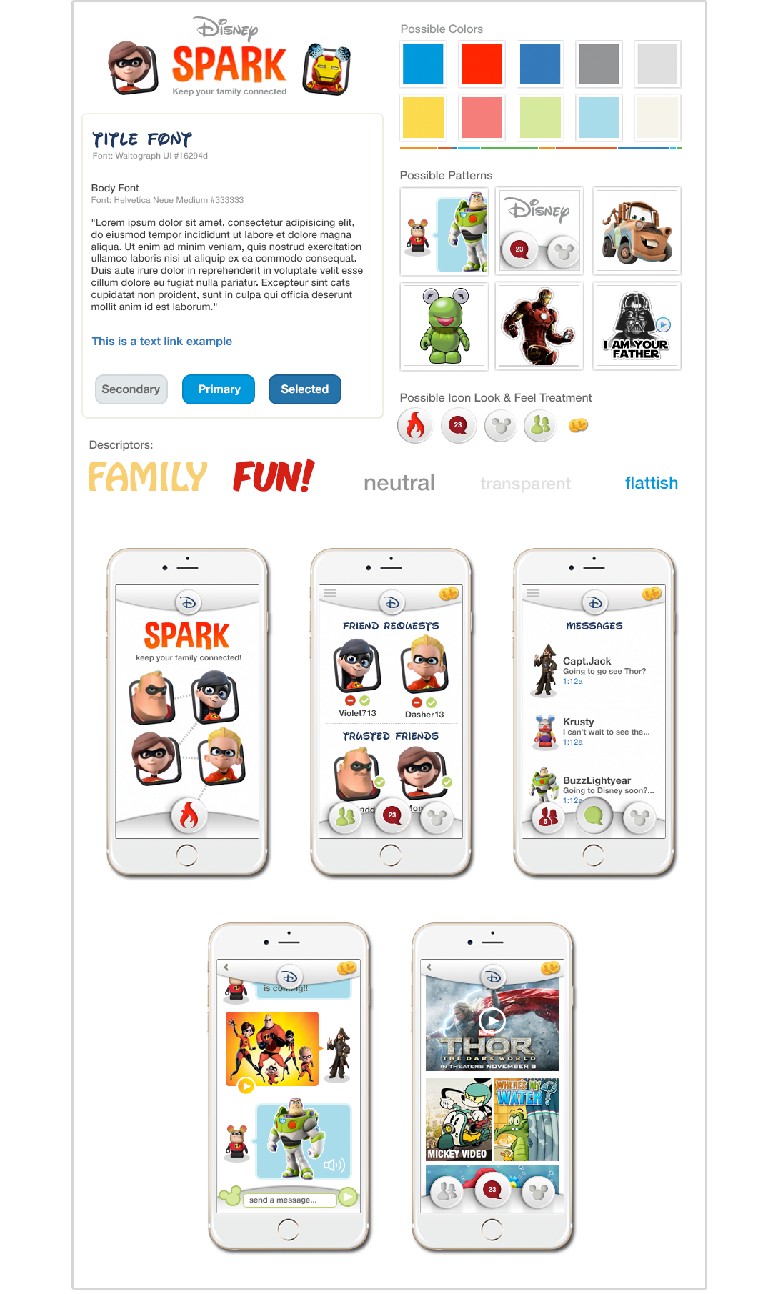
Style Tile V1
I opted to add Disney Infinity characters to the Avatar mix. To tie the two avatar look and feels together the a stylized frame was developed.
The white version with neutral grays was created with the idea of a classic portfolio case in mind. Something simple and elegant to contain and showcase Disney content, but not compete with it.
After the Style Tiles were completed we applied the new look and feel to a few key pages for comparison.
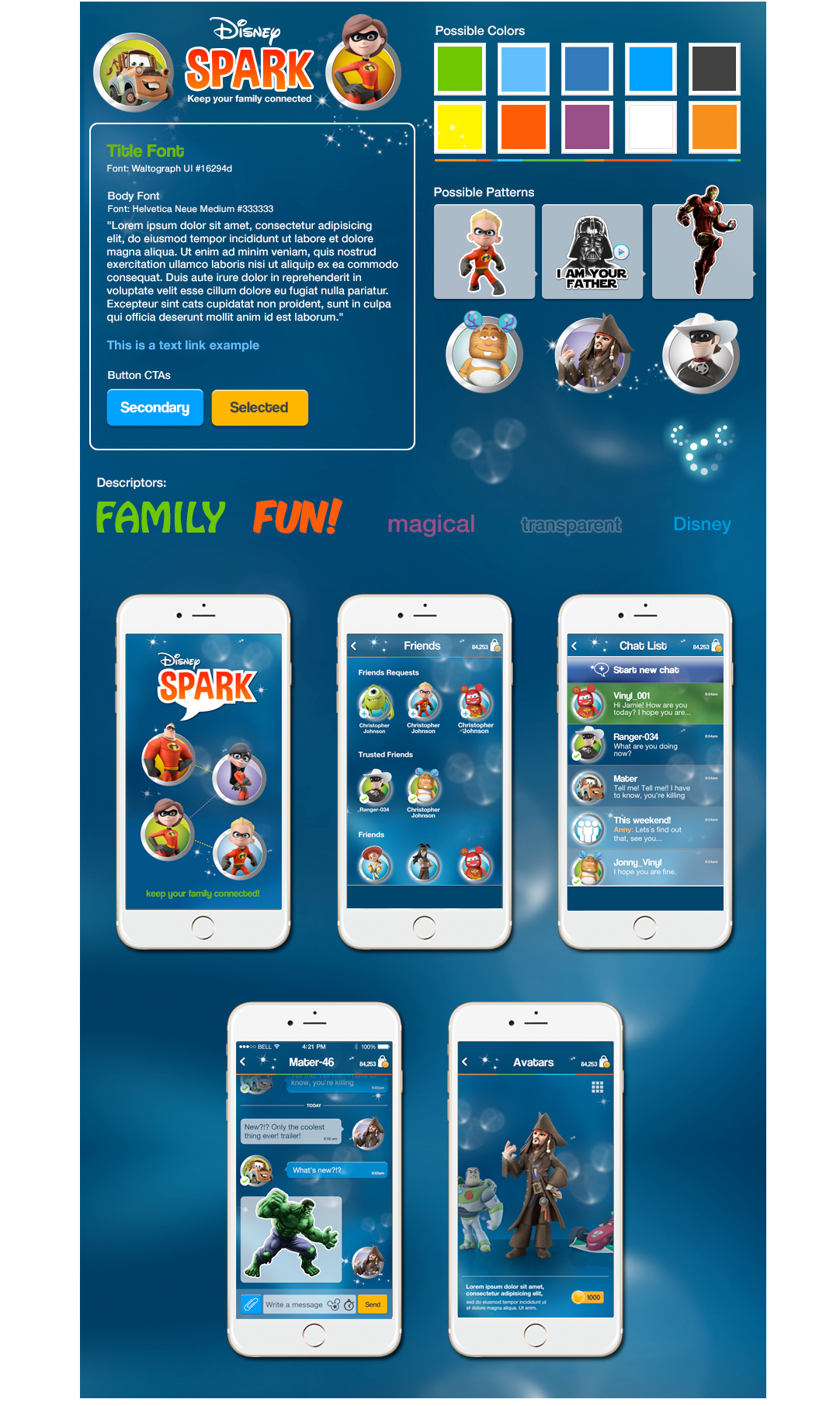
Style Tile V2
Style Tile number two applied the Classic Disney Blue to the background. We also planned to take advantage of parallax animations and have these faint translucent bubbles float about very subtley and form “Hidden Mickeys” in the background. New containers were created to contain and tie all the disperate avatar characters together. I also took the opportunity to colorize the backgrounds to establish a visual language for friends. Regular friends had a blue background. Trusted Friends a green background.
The Blue version was the one deemed a richer experience, so we moved forward with Style Tile #2, and went back and retreated all the existing art with the new look and feel. Then we tested it live with users, along with the newly implemented Sticker Packs.
User Testing Results Were Amazing!!
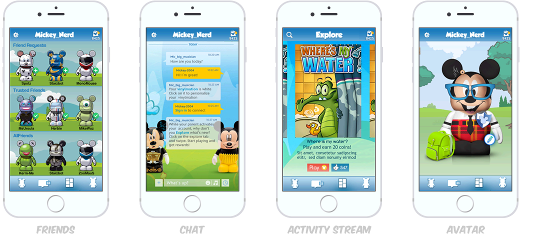
Screens tested:
My Profile, Avatar Selector, Friends, and Chat.
Participants:
5 boys, 5 girls, ages ranged between 8-12.
All pages performed very well in the testing and were well understood by the kids.
The real excitement of the test? Kids went absolutely bonkers for the animated stickers. One kid sent 40+ stickers out during his test. He simply couldn’t get enough of them.
- Static Stickers 70%
- Sound stickers 90%
- Animated stickers 100%
- In chat games 90%
- Activity Stream 90%
- Avatar picker 100%
Disney Spark – The Trailer
I worked AntFarm an agency in Los Angeles to create this Sizzle Reel. At this point in time the app was not functional enough to do video, as we were in the midst of a re-skin, so all the UI seen in this video was hand animated by me. This was presented to Bob Iger and used to green light the product for Geo Alpha/Beta. It was approved and launched as Disney Mix.